Dandy Candies and OEIS

Dan has an quite successful open problem going on over at his blog.

If I give you some cubical candies, what is the least amount of packaging needed for them?

Lots of great problem solving happening in the comments of his thread.  I took a few stabs at it myself. Beginning with making a list of the first few entries and trying to find solutions manually.  1 candy, (1,1,1) cube: surface area 6.  3 candies can be done with (3,1,1).  Surface area 14.  But something like 20 has a few options.  (10,2,1) has a surface area of 64 but (5,2,2) has a surface area of 48.

From that paper-work I was able to generate the beginning of this sequence of minimal Surface Areas: 6, 10, 14, 16, 22, 22, 30, 24… which I then searched on OEIS, resulting with https://oeis.org/A075777 .

I then decided it would be a good exercise in rudimentary python to try to encode that algorithm, so here is my script: 

(caution: this script generates inaccurate results, it is a script of the inaccurate OEIS algorithm.  My improved script is further down in this post)

This algorithm is very similar to some that others were using in Dan’s comment thread.  But here’s where it gets interesting.  Unless I have an error in my code (entirely possible!) then I think we have broken this algorithm.  Dan gives a few frequent algorithm-breaking-numbers here.  And indeed, a few of these break the algorithm on OEIS:

Take n = 1332 using the algorithm described on OEIS:
Cube root is ~11.002
Floor is 11, but neither 11 nor 10 divide n.
9 divides n.  s1 = 9
n / 9 = 148
Square root (148) = ~12.166
Floor is 12, but we need to subtract away 1 at a time until we find a divisor of 148: 4.
s2 = 4
Then s3 = 37
And that gives a surface area of 1034.
However, the minimal surface area is given by a solid of 6*6*37.  Surface Area is 960 in that case.
The algorithm also breaks for n=68 and n=74634.
We can see what the algorithm seems to be having trouble with is the first divisor taking too many prime factors along with it.  We do not necessarily want the largest divisor of n under the cube root.  I’m in the process of notifying OEIS (I need an account!) unless anyone sees a mistake on my part.
Lots of good mathematical practices happening here!
Update: I improved the algorithm so that it loops through s1s under the cube root that divide n and s2s under the square root of n/s1.  This is much slower, but should be accurate.

Here is a file for the results of this up to 5000: minSA csv up to 5000

And here’s one up to 30000 with columns n, s1, s2, s3, minSA: min surfacearea SF upto 30000

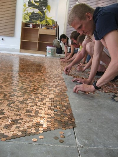
Copper Tiling… classic WCYDWT

Ran across this on reddit

The smile inducing “how much does it cost?” is a great place to start.

But how about “how much area is wasted?” to touch on the packing problem of circles. http://en.wikipedia.org/wiki/Circle_packing_in_a_square

And hey, might as well kick it up into 3D… http://www.youtube.com/watch?v=uDJ3sor2oQ0

Circle graphs are the worst

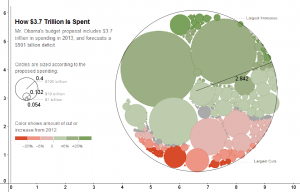
Flashy animations are all the rage on cable news networks.  And people love infographics.  Both show a illogical love for graphs made out of circles.

From the NYtimes.com : http://www.nytimes.com/interactive/2012/02/13/us/politics/2013-budget-proposal-graphic.html?hp

radii measured with geogebra after constructing a circle through three points plotted on the edges of the graphics circles.

There are two issues: squared ratios, and packing.

The first arises that as you change the radius of the circle, the area will increase by the square of the radius.  So the designer has to choose one measurement to represent their unit.  It appears that they chose area for this graph.  The given scale seems accurate for the $100 billion circle’s area to the $10 billion circle’s area.  However, the $1 billion circle appears to be off, or I can’t measure it precisely enough.  The problem here is that we are better at recognizing linear relationships rather than square relationships.

The problem here is human intuition.  Does the largest circle look like 10 times as large as the medium one?

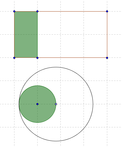
Consider these two representations of an area growing by a factor of 4.  Which is more natural?

To the unpracticed geometer, it may seem very difficult to believe four green circles fit into the large one.  Large area-scaled circles “seem smaller” than they should

That is the second issue: packing.  Rectangles are easy to pack.  Copy that green rectangle 3 more times and it will fit exactly in the area outlined.  But to fit the circle into its large circle of 4x the area, it requires distortions.  Those distortions harm the communication of knowledge.  Back in the first image, they attempt to pack a lot of various budget area’d circles in a large circle.  But the empty space makes the budget cover an area much larger than it should.

Infographics should always aim to present data in a way that makes it easier for the public to understand.  When style is chosen over substance, the information is distorted, literally.  Because of the competing effects of being too large or too small, I don’t believe the mis-communication was malicious.  Rather, it was ignorant.

WCYDWT / 101qs: 13 Folds

Dan Meyer has morphed his “What can you do with this” edu-meme into “#101qs”:  what questions pop into your head upon observing a picture, movie, or other demonstration.  The more likely it is that a student will ask that question, the better.

I will present one now.  For your consideration,

“13 Folds”

13 Folds

If you tossed that up in your class, what would the kids say?  What’s the first question that pops into your head?

I’ll offer my own thoughts, and I welcome you to share yours in the comments.

I think this image has a lot of things going for it.  It is clearly the ACT1 image.  Toss it up.  Don’t say anything.  What will the kids ask?

What is it?
Toilet Paper.
That’s hella toilet paper!  (excuse the norcal slang 😉 )
yeah!  it’s a lot!
How much?
I dunno.
What do you mean you don’t know!? you’re the teacher!
Can we figure it out?

At this point, you can go to ACT2:  Have the students figure out what they need.  In this case, there’s a rather nice ACT2 image:

Act 2

Alternatively, you could say 5 feet by 2.5 feet on the image.  Or if you’re really brave, you could estimate it by the heights of the kids in the screenshot.  Ideally, you don’t have to say much else.  To a stuck student I might offer only: “unfold it“.

Extensions:

  1. Graph it.
  2. How many rolls did they buy?  What did it cost them?
  3. How thick is the paper?  Graph THAT.
  4. How many layers are at the 13th fold?  Another graph to make!
  5. Why toilet paper?
  6. What is preventing the 14th fold?  Why did they stop?

And finally,

Act 3

Ah, but there’s a bonus:  we have the actual video of them doing the folds.  What a great way to end the class!

http://www.youtube.com/watch?v=vPFnIotfkXo

Why toilet paper?  Try the Mythbusters episode: http://www.youtube.com/watch?v=kRAEBbotuIE

And then for those super interested kids who can access the final extension questions, you can lead them through Brittany Gallivan’s solution for arbitrary paper: http://en.wikipedia.org/wiki/Britney_Gallivan

Credit to Dr. James Tanton http://www.jamestanton.com/ for leading the actual exercise at MIT.

Toss me some comments!

WCYDWT: Escalator

In the style of Dan Meyer’s WCYDWT… I may not have time to do a full lesson around this in my Algebra class.  There are only 4 days left and we are rushing through  the required tests.  But inspiration hit me when I saw this view:

I

Click for video

I put it up in my small 6th period class to get a taste for  how things would go.  Students immediately related to it (one kid correctly named the BART station) With a little prodding — “did you see the guy with the bike who was bookin’ it?” — they talked about how fast people were going.  Then they talked about trying to go down an escalator going up or up and escalator going down.  We didn’t get to any sort of problem solving, but we did count that it took about 30 seconds to merely ride the escalator up.

More on this as it develops… especially if I have time to implement it fully.

Nice motivator, Holt.

Right Triangle Dog

The Holt Geometry book starts every section with some “real world” application of the topic.

Its a bad book.

EDIT: I’ll revise my comments from earlier this year.  Its an OK book.  In writing classes a common piece of advice is “show, don’t tell.”  The Holt Geometry book, along with many others, fail in this regard.  It does nothing for a student to read in chapter 1 that a^2+b^2=c^2.  The Pythagorean theorem is a result of a long logical flow of geometric arguments.  (and still, the inane “Who uses this?” motivators make me want to defenestrate somebody) -2010.05.04